Back to projects

Branding

Bocatea

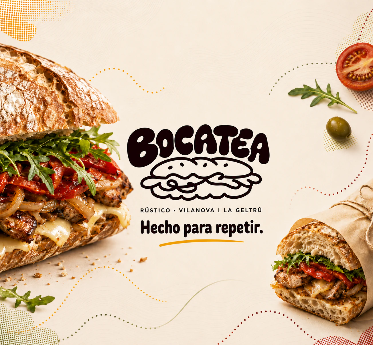
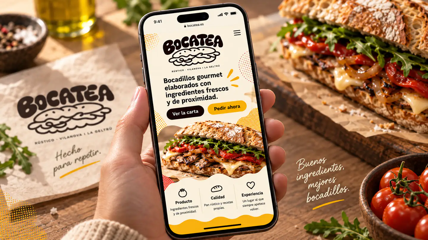
In Spanish, bocadillo means both a speech bubble and a sandwich. Bocatea brings the two together in one brand. We developed an identity that takes the expressiveness of comic strips into the restaurant world, with flowing shapes, full-bodied lettering and a friendly tone that invites people to share.

  • SectorRestaurants and hospitality
  • ServicesBranding and visual identity
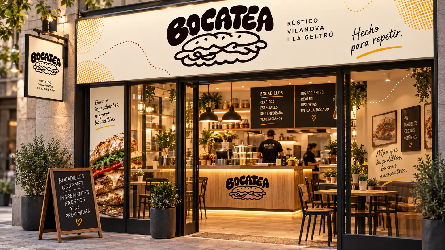
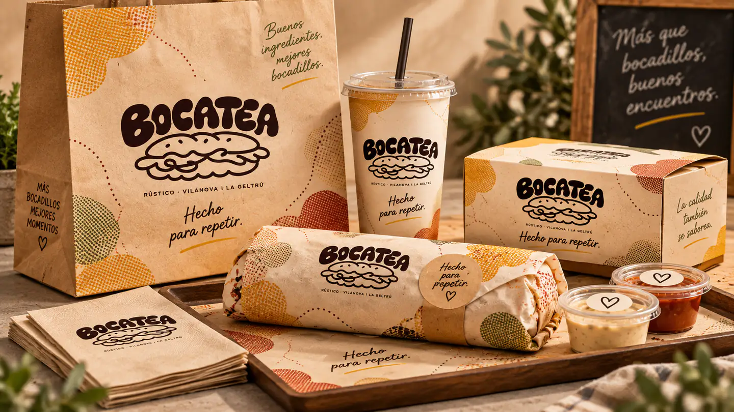
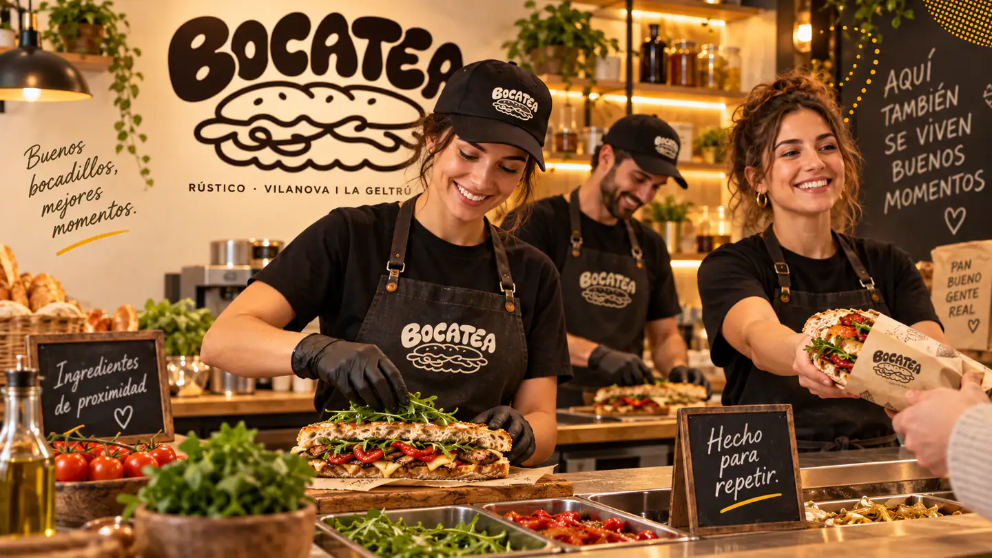
  • ScopeBrand, premises and packaging
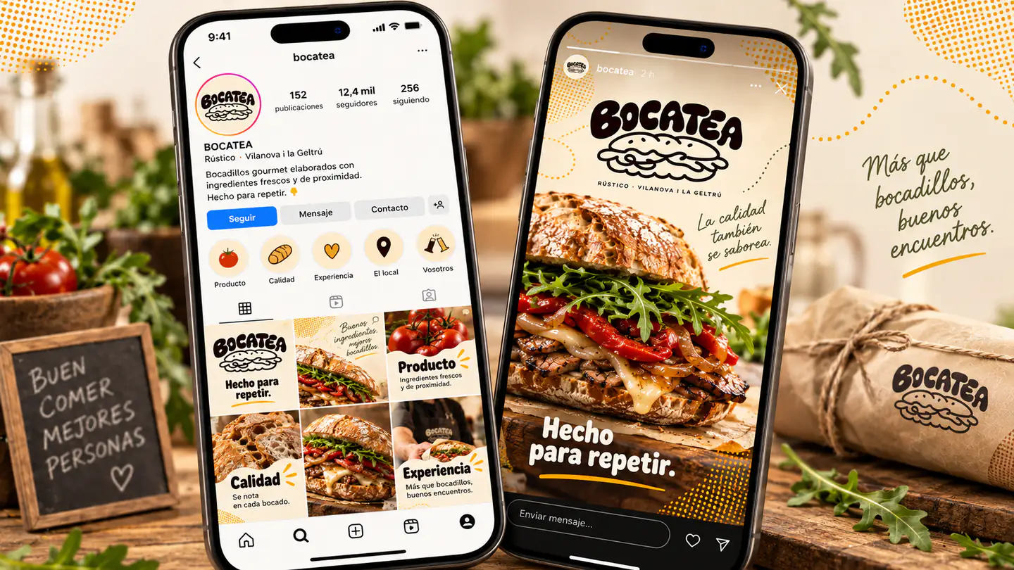
Bocatea visual identity with sandwiches and brand elements

Concept

Comic books as a reference for a restaurant brand.

The speech bubbles that hold the dialogue in comic strips are the starting point for Bocatea. From this device, we developed a language of flowing, abstract and geometric shapes that links the two meanings of the Spanish word bocadillo: what is said and what is eaten. That play on words gives the whole identity its meaning.

The expressiveness of comics carries through to the curves of the logo, the sandwich illustration and the rhythm of the graphic elements. The shapes have volume and movement, while the linework stays easy to read. The concept becomes a visual language for talking about food in an everyday, playful and instantly recognisable way.

The language of comics Flowing shapes Double meaning
System

Organic lettering and warm colours put food first.

Brand

The organic lettering and illustrated sandwich share broad curves and a bold presence. The name provides the voice and the illustration introduces the food. Together, they make the brand recognisable at a glance, keeping the connection between the expressiveness of comics and the product that gives the project its name.

Graphic language

The flowing, abstract and geometric shapes draw on the freedom of speech bubbles. Outlines, patterns and lines bring movement around the brand and photography. This visual vocabulary allows layouts to vary while keeping the same expression: informal, dynamic and rooted in the world of comic strips.

Colour

Dark burgundy on a warm base gives the logo weight and leaves space for the ingredients and photography. Colour accents accompany the graphic elements and add variety. The combination keeps the food in the spotlight and creates a welcoming presence, both in the restaurant and on the packaging.