Back to projects

Branding

Acompàs

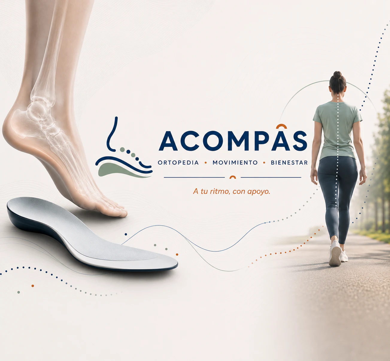
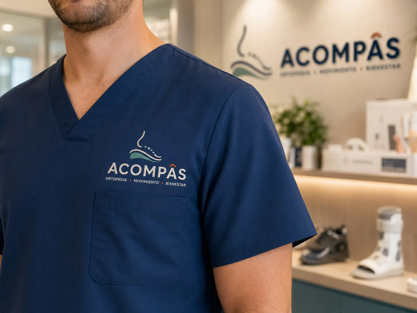
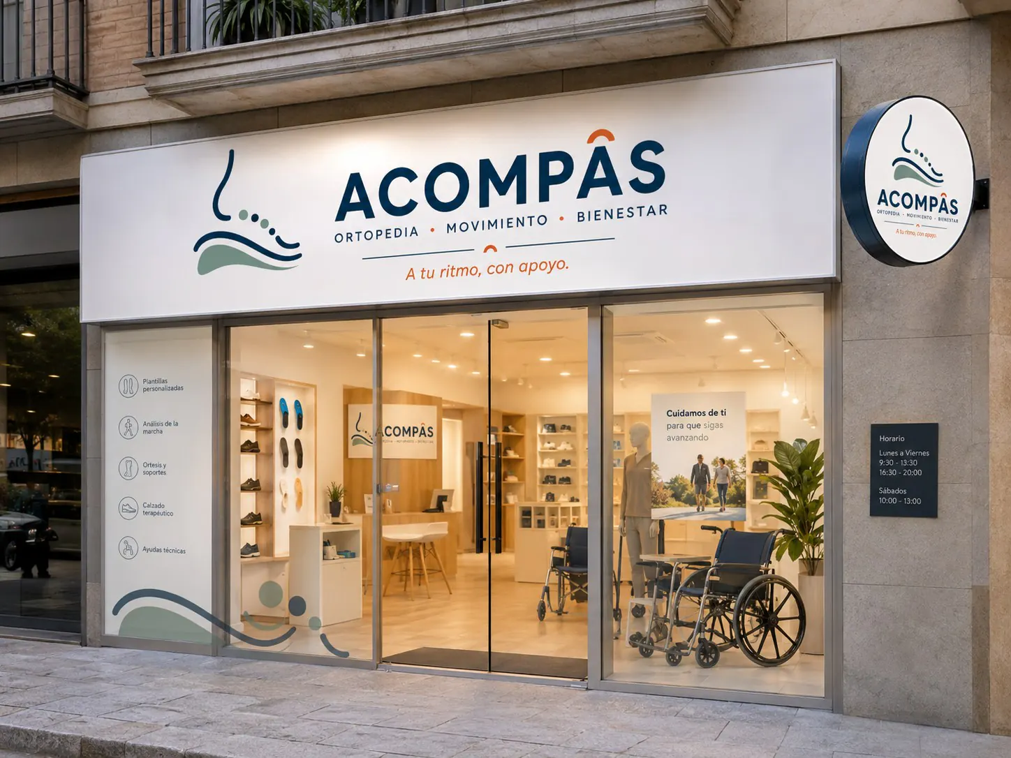
Acompàs brings orthopaedics, movement and wellbeing together in an identity that puts people first. The footprint symbol, soft lines and calm palette express an approach to care: offering support, building confidence with every step and respecting each person's pace.

  • SectorHealth and wellbeing
  • ServicesStrategy and visual identity
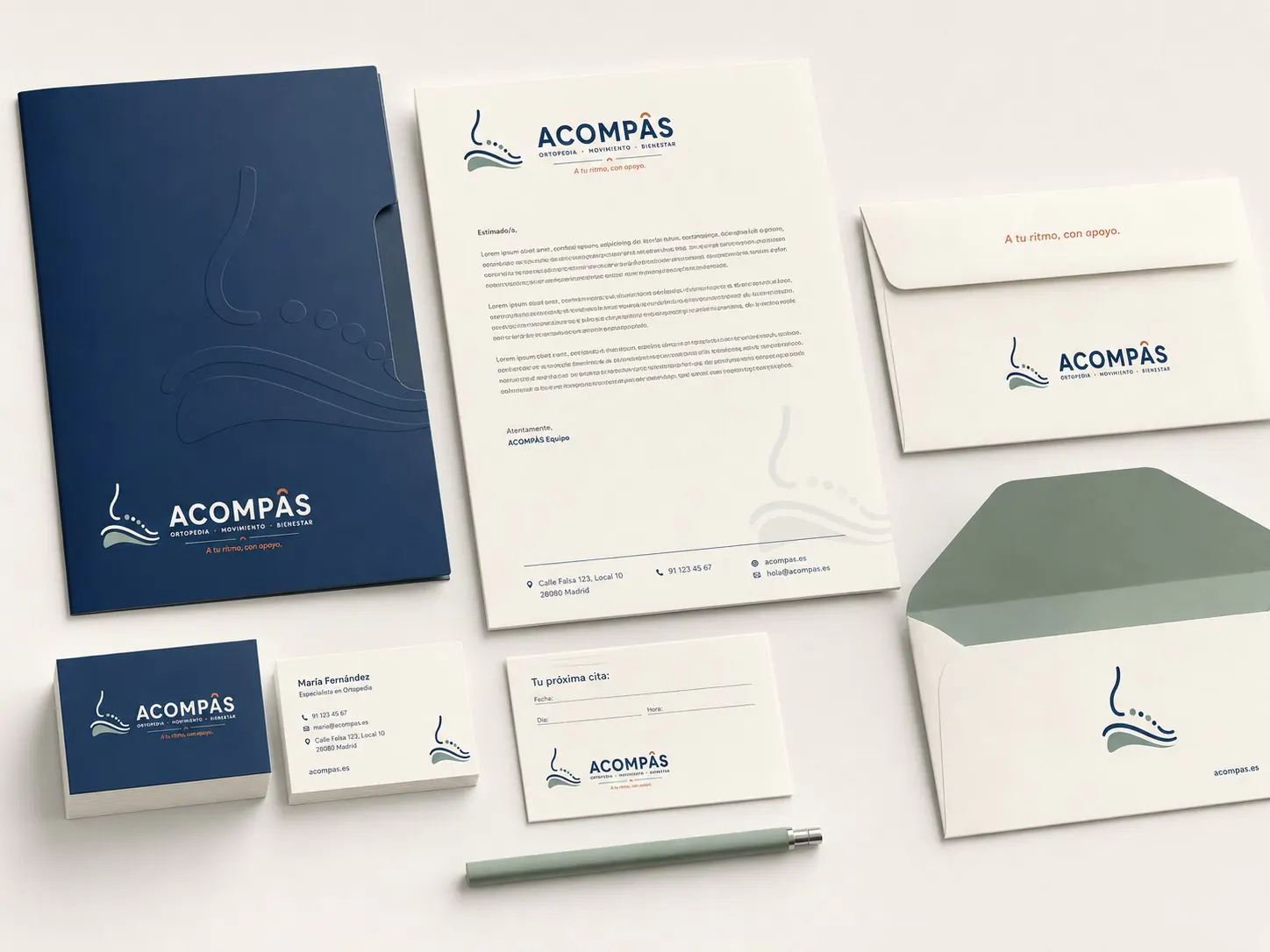
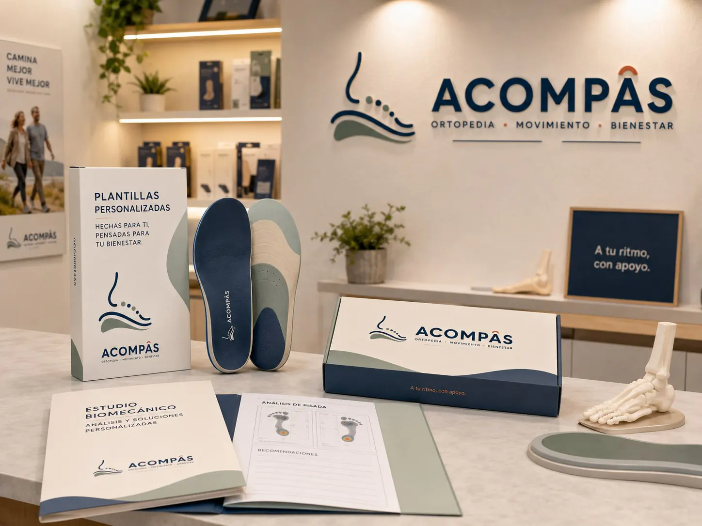
  • ScopeBrand, stationery and experience
Acompàs visual identity for orthopaedics, movement and wellbeing

Concept

The footprint expresses a connection between support and movement.

Every step needs support beneath it and room to move forward. This relationship between support and movement shapes the Acompàs symbol: the outline of a foot, the curve below it and a sequence of dots create a small path. The brand connects with orthopaedics through a familiar, everyday gesture, rooted in the way each person moves.

The name and the message ‘At your pace, with support’ put the same idea into words. Care means respecting an individual pace, and the identity expresses this through flowing curves, spacious layouts and colours that sit comfortably together. The result balances the clarity of a healthcare brand with the warmth of personal attention.

Your own pace Personal support Active wellbeing
System

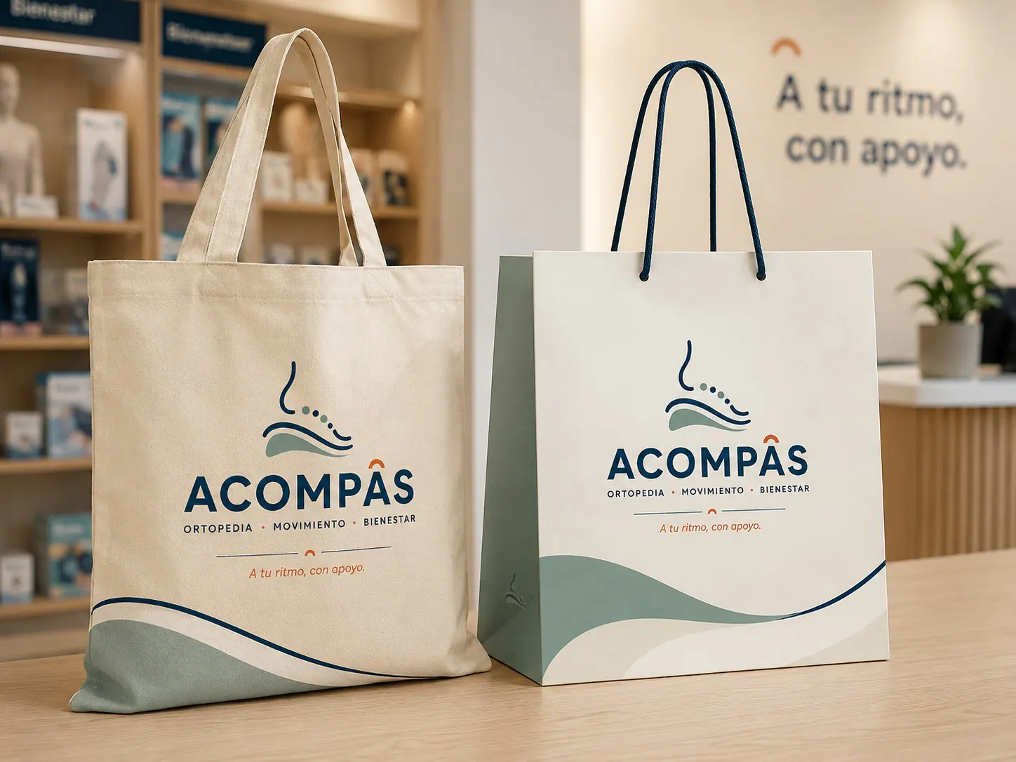
Soft shapes and colour make the communication approachable.

Brand

The symbol brings the outline of a foot and its support together in an open shape that naturally suggests movement. Beside it, the name has a confident presence and the descriptor ‘Orthopaedics · Movement · Wellbeing’ explains the service. This hierarchy makes both the Acompàs offering and its caring approach easy to understand.

Tone

Curves and sequences of dots extend the footprint's movement across the other materials. They create paths that accompany images and connect content. Space between elements keeps the reading experience calm, while the message ‘At your pace, with support’ gives the identity a direct, approachable voice.

Colour

Deep blue gives weight to the name and key information. Soft green accompanies the supporting shapes, while warm accents highlight small details and messages. Set against light backgrounds, this combination guides attention without overcrowding the layouts, giving the brand a professional, friendly and calm presence.

Next project

04 / 06 Amunt Vertical