Concept
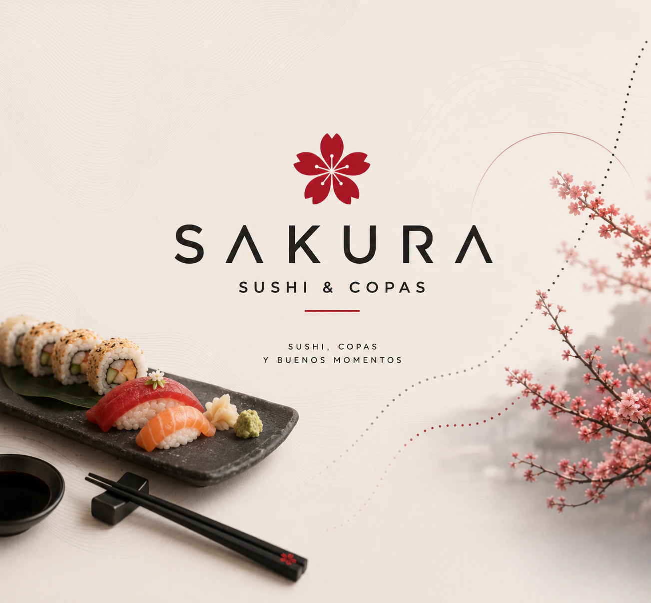
The cherry blossom gives the brand its Japanese reference.
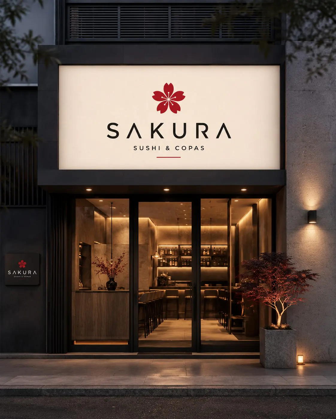
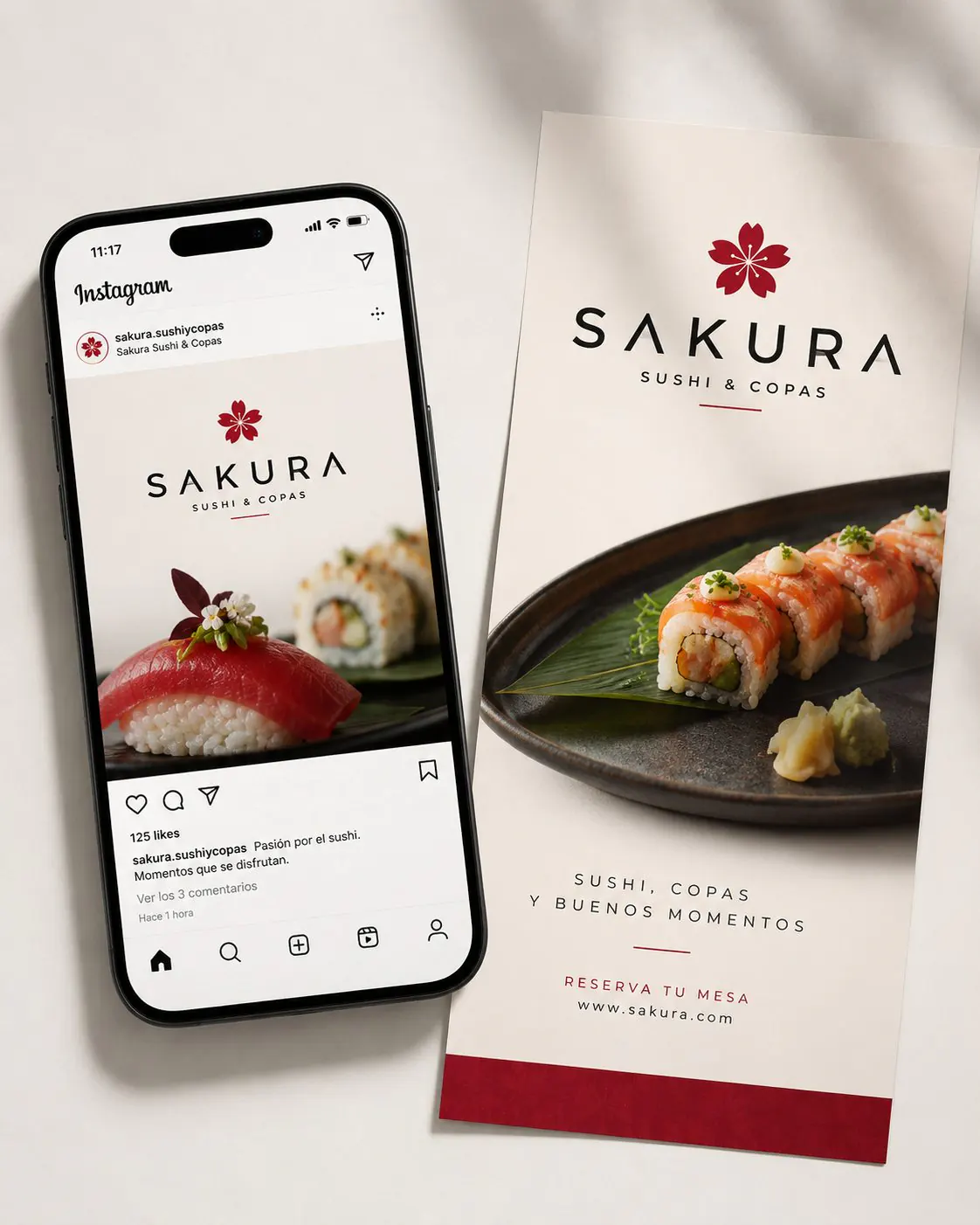
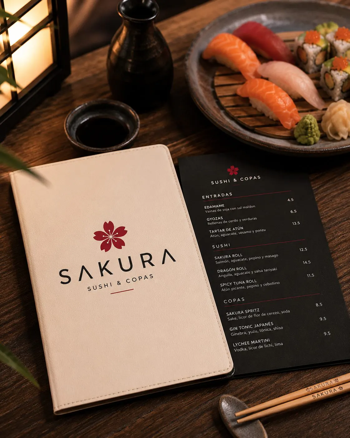
The cherry blossom gives the name Sakura a recognisable shape and places the brand within its Japanese world. Its petals add a delicate gesture that contrasts with the clean, open structure of the logo. Generous letter spacing lets the name breathe and allows the symbol, typography and descriptor to read as a balanced composition, with a clear place for every element.
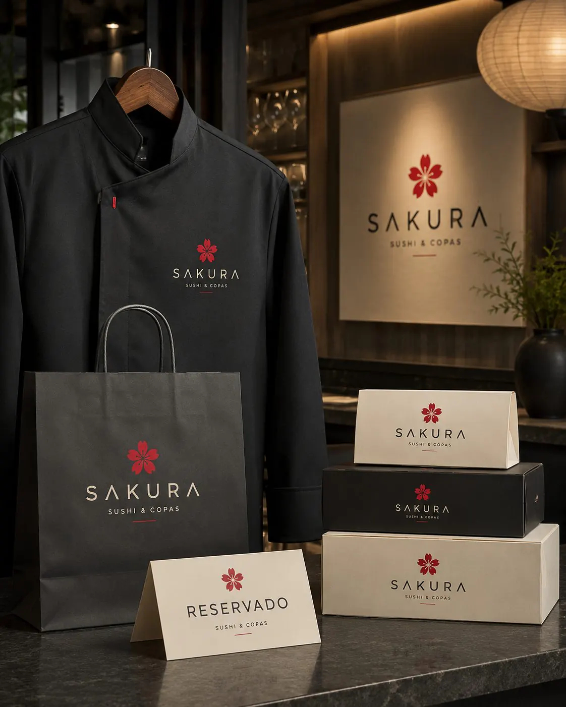
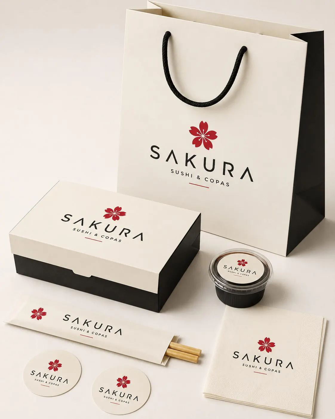
‘Sushi & Copas’—sushi and drinks—brings together the two sides of the project and guides the identity's character. Warm backgrounds accompany the food; black introduces a more intimate atmosphere associated with the bar and the evening. The red flower connects both moods and focuses attention on a detail that can carry across the brand, from menu to signage.
Sushi & drinks Understated elegance A Japanese accent