All projects

Branding · Energy

Lión Emax

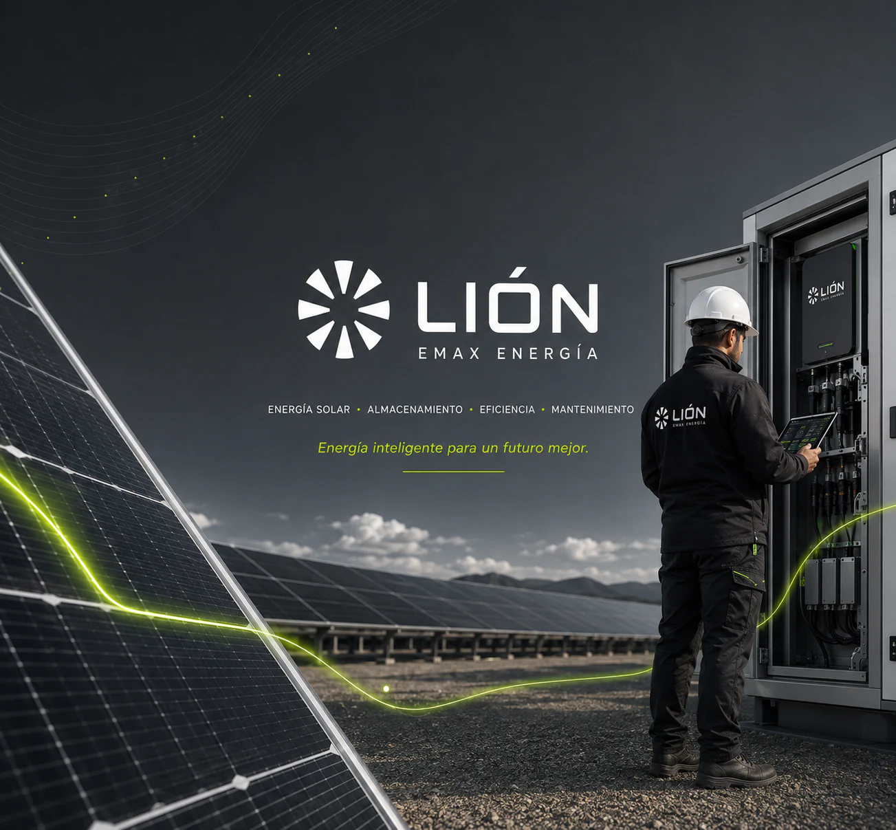
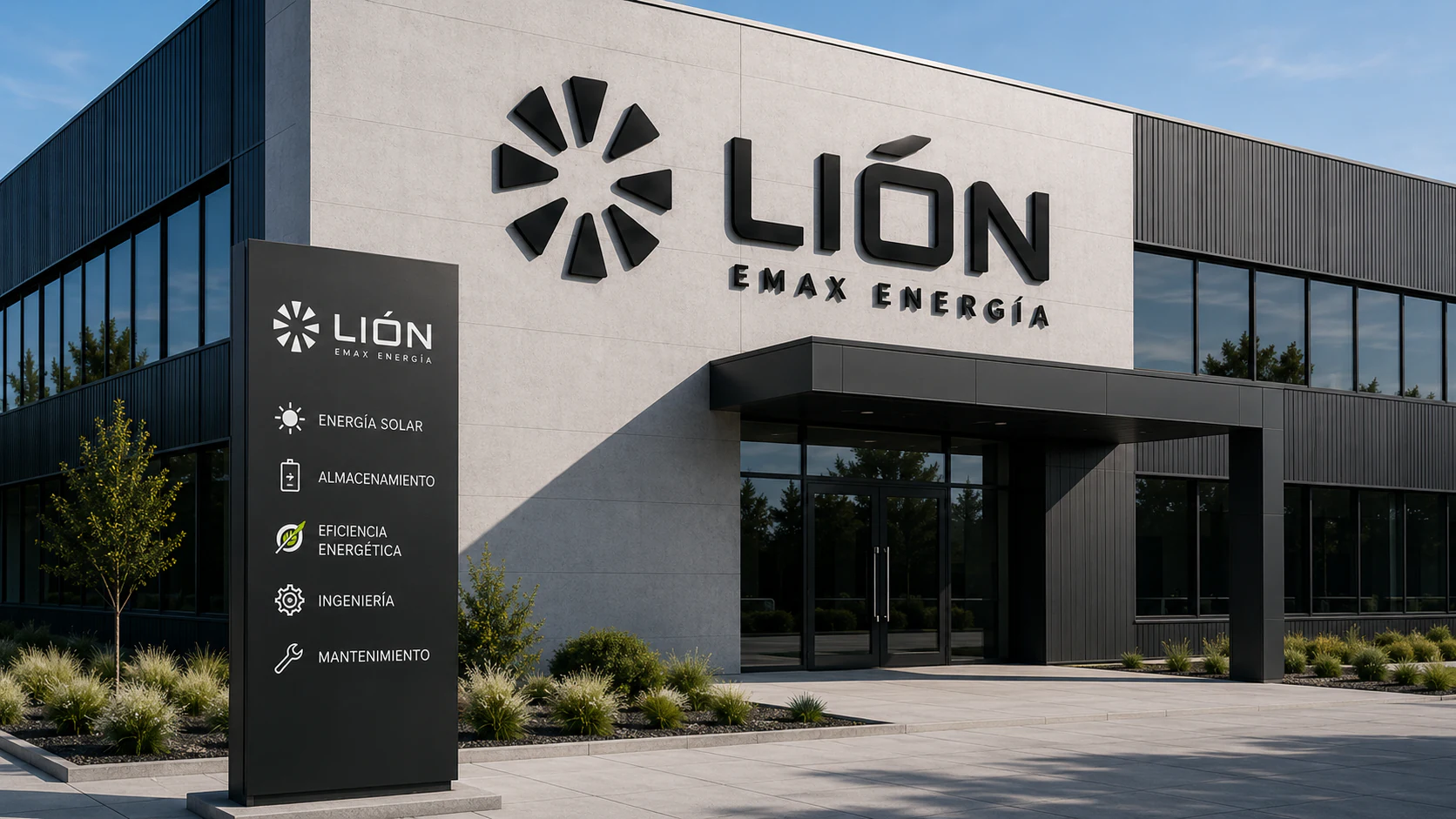
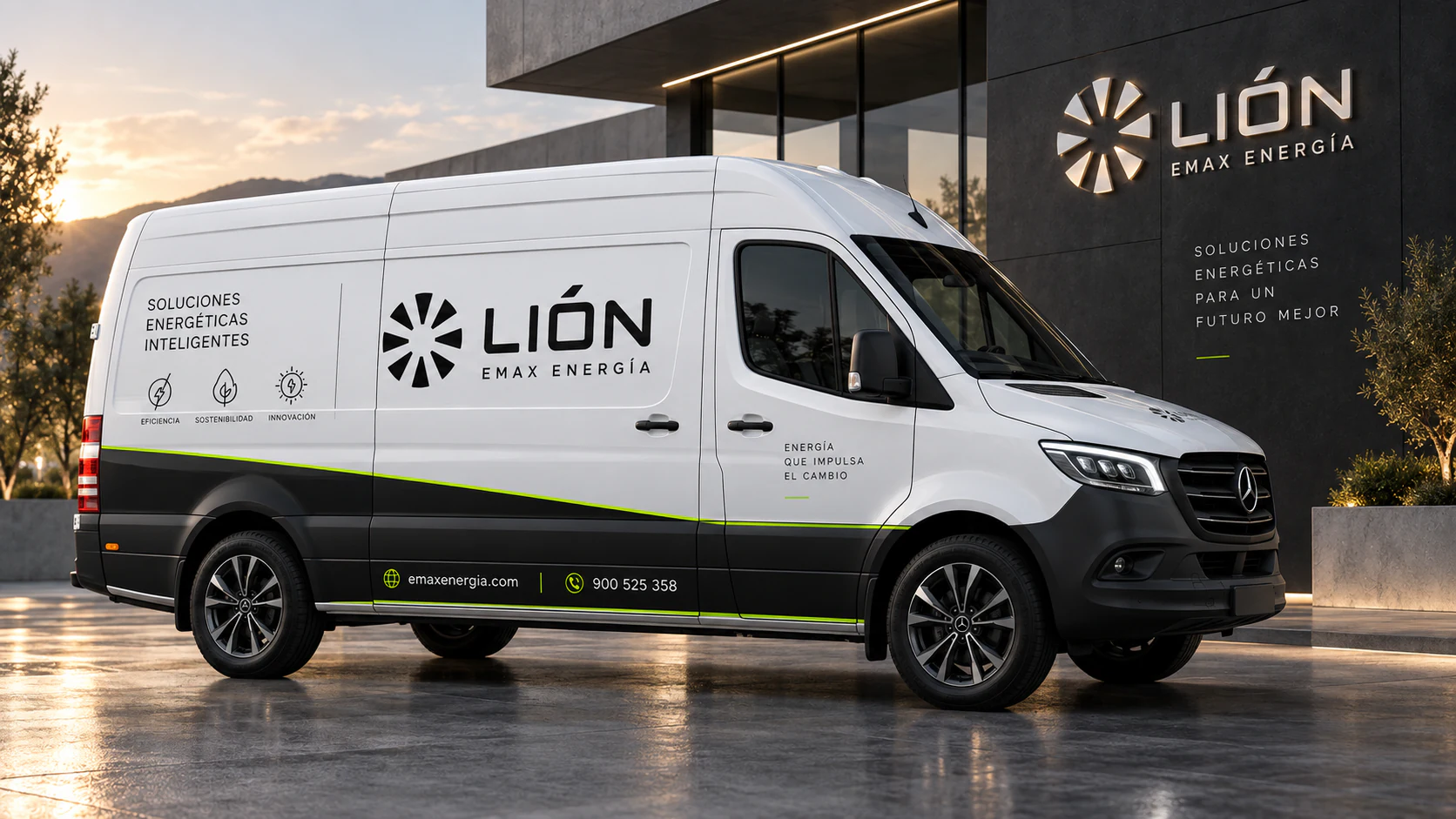
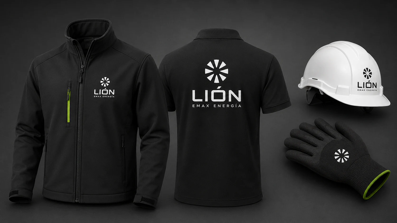
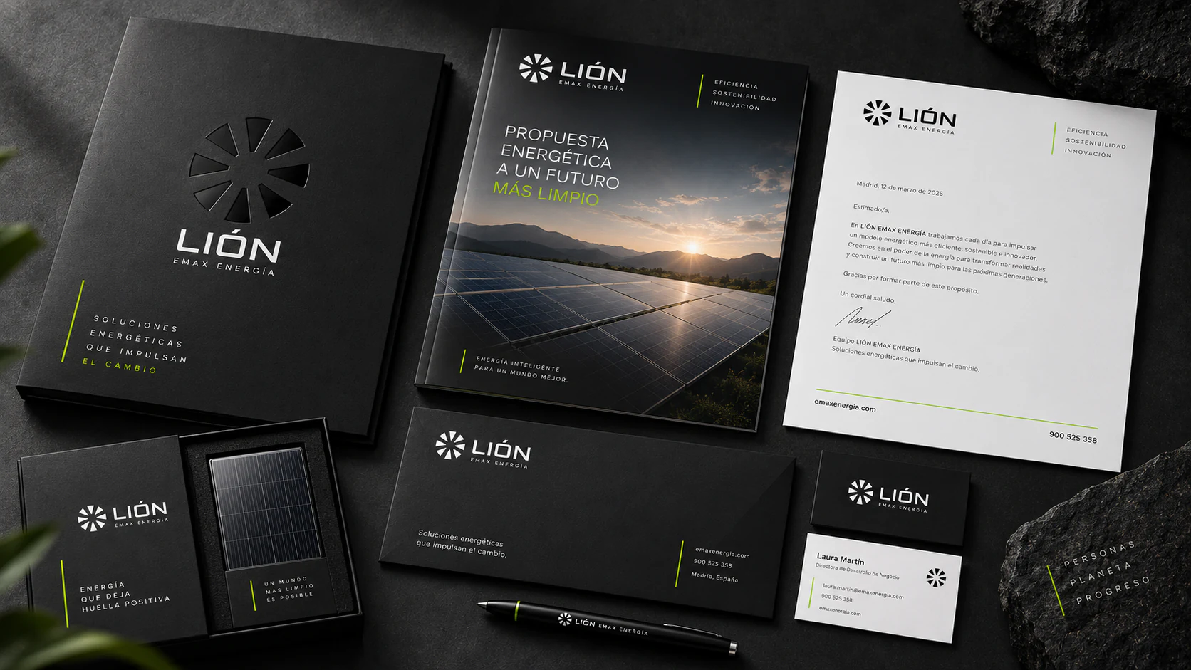
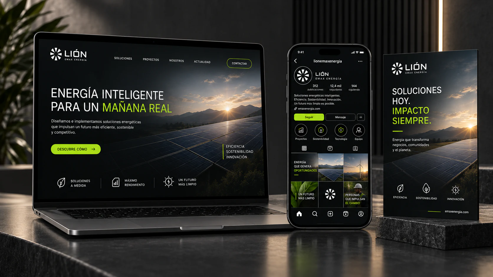
Lión Emax translates energy into a visual language of precision and contrast. The radial symbol, technical typography and acid-green accents create an identity with strong visual impact, connecting facilities, vehicles and equipment through a recognisable presence in industrial settings.

  • SectorEnergy
  • ServicesBranding · Visual identity
  • ScopeFacilities · Vehicle · Equipment
Lión Emax energy system with a technician, solar panels and storage

Concept

A radial structure suggests the movement of energy.

The Lión Emax symbol arranges a series of elements around a centre. This radial structure suggests a rotor or generator, turning the movement of energy into a compact form. Repetition, spacing and geometry convey precision; the name carries that character through with technically constructed typography and clean strokes.

The contrast between dark surfaces and acid-green accents introduces a second idea: energy as a visible signal. Colour appears in lines and details running through the layouts, while white keeps the brand signature clear. This relationship creates an industrial presence with varying levels of intensity, from stationery to vehicle graphics.

Industrial energy High contrast Technical system
System

Dark backgrounds and acid green give information a clear hierarchy.

Brand

The radial structure concentrates the brand's character in a compact symbol. The name has a broad presence and the descriptor ‘Emax Energía’ explains the activity at a secondary reading level. Spacing between these elements keeps the signature orderly and provides a common basis for corporate applications and equipment.

Contrast

Black and dark greys connect with the materials and surfaces of industrial environments. Against that base, white ensures legibility and acid green introduces direction and movement. Used in lines, accents and details, it focuses attention and prevents every part of the composition from competing at the same intensity.

Scale

The identity moves from business card to façade by adjusting the signature's size, the available space and the amount of information. On vehicles and workwear, the symbol and name take the lead; on stationery, the layout leaves room for content. Contrast and geometry keep every piece recognisably connected.

Next project

Onew